
Nomad.
An app designed to help international travelers venture into another country with confidence.

Scope: 1.5 months
Role: UX Researcher/Designer
Team: Product designer, Tiffany Eaton, provided guidance throughout this project
Tools: Figma, Google Forms & Docs
Skills: UX Research, Information Architecture, Sketching, Wireframing, Visual Design, Usability Testing`
Context.
Being a respectful global citizen was something my parents instilled in my sister and I from a young age. A couple years ago, I had the privilege of living in Israel for half a year. I rode the public buses, bartered in the markets, and attempted to use basic Hebrew and Arabic phrases with locals. Though I did a little research before my travels, I wonder how my time overseas would have been impacted by more preparation prior to my arrival.


Most travel apps on the market have to do with bookings and recommendations. Little market share within the travel industry has to do with education. I knew there had to be a better solution for international travelers to learn about what to expect in another country, from cultural norms to safety information, transportation options, and common foods a traveler will encounter.
With the guidance of a product designer, I spearheaded the entire design process of this project from initial user research to iterations, prototyping, and usability testing.
Solution.
Meet Nomad, an app designed to help international travelers venture into another country with confidence. From one platform, a traveler can learn about what to expect in the culture, health & safety, transportation, and food of their destination country within a few clicks!

Explore Articles.
After selecting their destination country, travelers can browse articles that cover a wide breadth of information:
Get info on available long-haul and short-term transportation (eg. train, bus, and taxi) as well as the local climate that might affect travel.
Understand social norms, religious customs, cultural expectations, and accepted clothing. Learn common phrases and appropriate gestures.
Become aware of healthcare practices, water quality, and recommended vaccinations. View crime reports and understand local jurisdiction.
Discover popular cuisine and drinks. Learn about local marketplaces, common agriculture, and dining advice (eg. tipping and etiquette).
Search & Translate.
If a traveler hears about or witnesses something new in their destination country, they can easily search for articles on that topic.
What if the traveler is in a pinch and needs to understand the local language? Type a phrase, take a picture of a menu, or use the microphone to translate on the go!

View Ratings & Recommendations.
A traveler can see how previous visitors rated the condition of public transportation, the safety of drinking water, and the cleanliness of hospitals.
Similarly, a premium nomad user can learn what other travelers wished they knew before making it to their destination!
Process.
Designer Business Goals: By creating a paid product with better features than the free experience and giving users the opportunity to upgrade to a better product, users will pay the subscription fee, leading to a profitable revenue stream. Nomad needed to design an experience that allowed users to subscribe and gain access to their paid product. Therefore, the following were two specific objectives that I considered throughout the design process:
Create the opportunity for new users to subscribe to the premium product upon registration in the signup flow.
Create the opportunity for returning free users to become paid subscribers in the sign-in flow as well as within the product (once logged in).
I also spent time brainstorming a brand identity and company UI style that would match the following target audience:
18 - 24 years old
Very tech-savvy — they are on their phones for several hours a day
Very budget-conscious
International travel is a frequent aspect of their lives

First, I sat down first to develop a project timeline, detailing the main phases of the design cycle from research to final iterations.

Research
Objective: The intent of my research was to identify potential users and discern what travelers did or felt they needed to do to feel prepared for their journeys abroad. The following were questions I used to guide my research:
What causes travelers to feel uneasy when traveling to a foreign country?
What do most travelers currently do to prepare linguistically and culturally for their journeys abroad?
What apps (if any) do travelers use to learn a language before a trip?
Are travelers curious about learning more about a host culture’s language, customs, or behavioral expectations before traveling to that country, but just don’t have the means of understanding?
Methodologies: I conducted both primary and secondary research to gather insights into user needs.
User survey to assess current practices
User interviews to understand the international traveler's pain points
Secondary research
Competitive analysis
User Survey: Initially, I was convinced that the design solution should be language-focused with other supplemental material about the cultural customs within each country. Instead, what I found was that learning a language was not the travelers’ primary concern.

User Survey Results:
Only 15% of international travelers from my poll felt that learning the language of the host country is necessary.
However, 100% of participants believe learning about the cultural expectations of their destination is important.
92% of those individuals claimed learning about the cultural expectations of their destination is necessary.
Traveling to another country brings with it a number of challenges and difficulties. Some of the primary obstacles are language and cultural barriers. Most language apps/resources such as Babbel, Rosetta Stone, and Duolingo help individuals learn an entire language from the ground up--which takes considerable time and investment. While these products are effective in helping individuals learn, they do not provide users with an expedient offering of information that they need before or during their travels abroad.
In the past, travelers would consult a guidebook to prepare themselves for safety, cultural, and social expectations. With the expansion and explosion of the internet, that centralized location of information has been lost; users now piecemeal their information together from multiple sources online and from their personal connections.
Insight: The primary need for travelers is a consolidated place to learn about a country and its cultural, social, health, transportation, and safety expectations.
User Interviews: I contact 5 participants from the survey for a follow-up interview. Two of these were conducted in person, and the other three were remote. The goal was to probe a bit deeper and learn what international travelers considered valuable and necessary knowledge to learn about a country before visiting. I did some brief affinity mapping to isolate the main types of content travelers need/want access to before an upcoming trip.
Looking back, I had drastically undervalued the value of user interviews. Many recounted story after story of positive and negative experiences when traveling that supported the need for understanding and learning this information before an international trip. Already after my second user interview, my mind began churning with plenty of ideas about a differentiated product for international nomads.
Ideation
I turned my analysis and insights into a “How Might We” question to guide the next phase of ideation. The question which guided my thinking was the following:
How might we help teach international travelers about the cultural, social, health, transportation, and safety expectations so that they feel prepared in their destination country?
From this question, I developed three main user stories that would match the needs of an international traveler and began sketching to brainstorm some key pages within the mobile app. These were intentionally sketched out after the user viewed information or translated content so that the user’s did not run into paywalls to use the basic functions of the app. I thought of 3 separate subscription screens—one during onboarding (screen 2 of the first sketch), a pop-up subscription offering after reading an article (screen 4 of the second sketch), and a pop-up subscription offering after using the translation feature (screen 8 of the second sketch). Since the subscription business goals were constraints I worked within, I made sure to include an initial paid product offering screen during the onboarding process and then later on as the user interacted with the product.


Wireframes & Wireflows
Using the initial sketches as a starting place, I fleshed out the stories into three separate user flows and created wireframes accordingly.
Flow 1: As a new user, I want to explore a category (public transportation) of a country (Argentina).
View the welcome page.
Select destination country (Argentina).
Consider premium product offering access to regional/city-specific information.
View home/explore page.
Select category (safety).
Select sub-category (public transportation).
Select sub-category option (trains).
View article (trains).
Note screen 4 in the wireframes below. The subscription screen includes a vertical progress bar, making the step of subscribing a natural part of the user’s journey. I specifically placed this screen after the user selects their destination country. That way, they felt like their needs to learn about that country would be seen before being asked if they wanted to pay for more features. Notice the appropriate “Skip” option in the top right, reminding the user that they do not have to subscribe at this point in the journey.

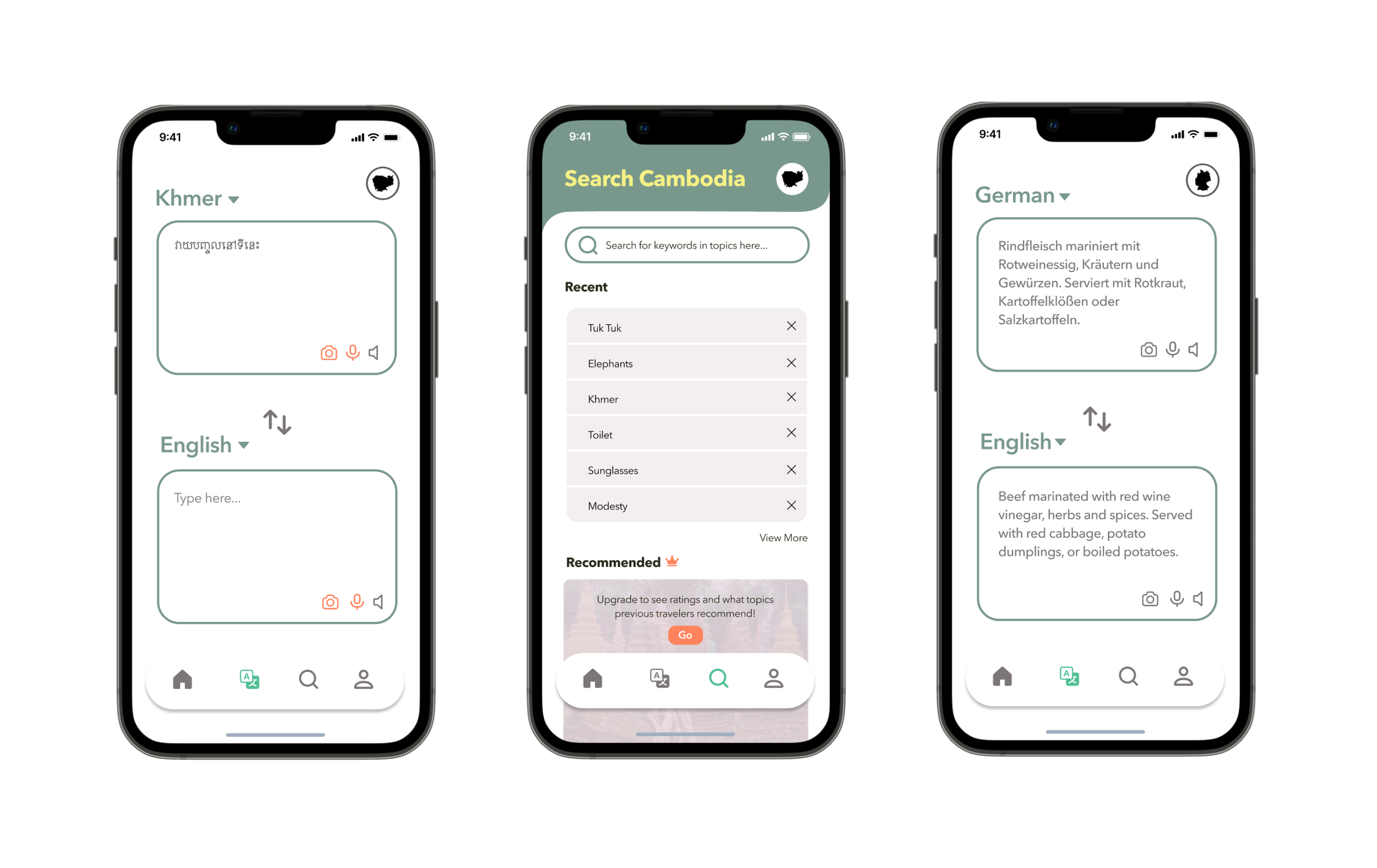
Flow 2: As a returning user, I want to search for a clothing expectations in a given country (Cambodia).
View home/explore.
Search for keywords in the search bar (orange robes).
Select article in results.
View article (orange robes).
View second article (Cambodian Monks).

In the final screen of this flow, the user is presented with a subscription banner. The fifth and sixth wireframes show the difference between an article the user has free access to and an article the user would need a subscription to access. This alleviates the anxiety and frustration a user would feel in not being able to access any free content; some content is free, and other requires an upgrade. The banner is intentionally small so as to not overwhelm the user, but let them know that they can access more info by upgrading to the premium product. Again, the placement of this subscription was intentional to not make the user feel like they ran into a paywall and get frustrated with the app.
Flow 3: As a returning user, I want to translate a menu from one language (German) to my first language (English).
View homepage.
Select the translation page in the navigation bar.
Select camera.
Capture photo.
View translation of photo.
View premium product offering more information on German cuisine.

The placement of the subscription offering in the third flow is much like the second. After using the translation feature of the app, a pop-up subscription offering presents itself. This subscription page was specifically designed in its copy and placement to not feel like “another” time the app is asking for payment but an opportunity to learn more about German cuisine. That is why “dietary expectations,” “health concerns,” and “common etiquette” are listed as additional content the user can gain access to.
Usability Testing (Round 1)
After wireframes and wire flows were developed, I quickly ran them by a set of users to determine their usability. Although all of the users were able to successfully complete the three flows, there was an apparent issue in the organization of the content. Users were unsure of what was a part of the free content and what was premium. Please scroll through the findings below for more detail.
It was from this first round of testing that I realized I tried to create designs without solidifying the information architecture. I had some of the main categories of information to include on the explore page (i.e. safety, culture) from my affinity mapping, but I never created a sitemap where the content was fully fleshed out. Since I skipped this and carried on with developing user stories, flows, and wireframes, it was like baking a cake without the accuracy of a recipe. Ultimately, this resulted in user confusion since I had not clearly defined what would be a part of the free content and what would be saved for the premium product. Users felt confused and lost trust in the brand because of the abrupt paywalls they encountered when moving through the flows.
So, I circled back to the drawing board. I returned to my affinity map, re-organized the topics into four main categories, and developed a sitemap. I scrapped the first cake and went back to my initial ingredients. Below is the final product of this analysis. I walked away with the following four main content categories that became the new structure for the explore page: transportation, society, health & safety, and food. Feel free to zoom in and view the categories in detail.
Hi-Fi Mockups
With a solid recipe (information architecture), I was now ready to move forward with hi-fi mockups. Three main iterations were made during this stage based on problems discovered during user testing:
Explore page structure
Subscription placement and copy
Brand identity
Problem #1: Explore Page Structure
The image below the progression of this page from the wireframe to the hi-fi mock-ups.

Problem #2: Subscription Placement
Because I had organized the content into four main categories of free content, I was able to then determine what would be offered in the premium product. First, I outlined a description of the free content (transportation options, societal expectations, health & safety info, and food & diet) on the second screen above. This was included to clarify the app’s core purpose to the user.
Next, I was able to determine the content of the premium product. The following became the four additional features a premium user would gain access to when subscribing:
Regional differences
Health & safety ratings
Traveler recommendations
Camera & mic translation features
Detailed descriptions of these can be found on screen 6 of the flow above.
Lastly, I made new subscription screens that were unique to each of the four premium features and placed them in strategic locations. For example, screen 11 specifically presents the user with the opportunity to gain access to recommendations from previous travelers. This is placed in the flow, after the user sees the blurred-out recommendation section on screen 10. Likewise, screen 18 presents the user with the opportunity to gain access to safety and health ratings in Argentina (another premium feature), and it is placed strategically after the user sees the blurred-out ratings in the image of screen 17.
Please zoom into the circled designs above and read through the specific copy on each unique subscription page.
Problem #3: Brand Identity
After the user testing, the hi-fi mock-ups underwent multiple UI changes. Initially, the color palette was designed to reflect a bold, smart, and hip brand. But since the app is primarily picture-based, I realized that the UI needed to complement and not compete with the images presented. During user testing, multiple users freely mentioned their appreciation for the images, without being asked about them. Therefore, I spent time playing with the UI of the explore page since it is one of the key screens. Eventually, I settled on a UI and altered the icons and color palette accordingly. Above is a screenshot of my process and iterations.

Below is a selection of key screens displaying the hi-fi mockups.

Usability Testing (Round 2)
Thankfully, the hard work of restructuring the information and altering the UI paid off!
100% of users were able to complete the following:
-Create an account and consider premium product during onboarding
-Flow #1: Explore a category (public transportation) of a country (Argentina)
-Flow #2: Search for clothing expectations in a given country (Cambodia)
-Flow #3: Translate a menu in German to English
-Change the country being explored

As evidenced by user flow success rates, users understood the general layout and structure of the four main categories. Users expressed that the categorization was “clear,” “intuitive,” and “straightforward.” Because the architecture of the app was understandable, users didn’t feel as blind-sided by the premium offerings.
For that reason, users were quite interested in subscribing at various points in the user flows. As displayed in the graph below, the following were the findings about when a user was willing to sign up for a premium account:
-60% of users wanted to subscribe to premium product during onboarding
-80% of users wanted to subscribe for recommended articles and previous traveler ratings
-100% of users wanted to subscribe for specific regional/city information
-20% of users wanted to subscribe for camera/mic translation feature

For a more in-depth look at the second round of usability testing, check out the slidedeck below:
Final Iterations
After the successful second round of usability testing, the designs only required some fine-tuning. The final iterations made to the hi-fi mock-ups included:
Review and alter copy on subscription pages, if needed.
Make the brand/splash page image globally inclusive.
Continue to re-prioritize topics for four main categories (and adding new topics).
Change copy of “View All” button to “More” and move below topic tiles.
Add subtitle explaining active links.
Iteration #1: Subscription Page Copy

Iteration #2: Brand/Splash Page Change

Iteration #3: Add New Topics to Categories

Iteration #4: “View All” Copy & Placement

Iteration #5: Article Links

Final Reflections
The main takeaway I had from this capstone came from the two main problems I faced: the structure of the app and its content. Both of these were tied to determining the differences between the free and the premium product. Because I was working with an intangible sitemap, user frustration and confusion would only continue to surface as I moved forward with iterations. It’s really difficult to design a service and experience around a moving product. Once I took the time to redefine my free content—or the commodity (transportation, health & safety, culture, and food info for each country)—and product (the revolutionary idea of consolidating all of that information in a mobile app), it directly impacted the development of the service/experience (premium features) around that core product. Once I cemented the categories and determined what would be a part of the free and premium product, I was finally able to specify what would be included in on the subscription page for that premium product. Likewise, I could nuance the four separate subscription offering pages with those four different premium features. Overall, this created multiple opportunities for the user to subscribe since those premium offerings were sprinkled throughout the flows in more subtle and strategic ways. In the end, this fulfilled the designer business goals I initially set out to accomplish.
Lesson Learned: Sometimes taking one step forward and two steps back is what you need for a good design to be reached. While I felt defeated in the middle of the design cycle, I knew that poor information architecture could not be ignored. Solidifying the structure of your product and the content of your product is well worth the investment!