
House2Home.
An e-commerce site making your interior dreams a reality.

Scope: modified GV design sprint
Role: UX Designer
Team: Product designer, Tiffany Eaton, provided guidance and collaboration throughout this project
Tools: Figma, Google Docs & Forms
Skills: UX Writing, Visual Design, Usability Testing
Context.
House2Home is a new start-up that wants to help new homeowners decorate their living spaces and ultimately transform them into the homes of their dreams. After the arduous process of moving, most individuals don’t have much time or money to dedicate to artfully decorating their new abode. Many users have a vision for the aesthetic they want in their new home and a clear budget. However, these users don’t know where to start shopping, get overwhelmed, and give up.
House2Home seeks to meet this need. This e-commerce platform sells popular decor such as prints, photos, posters, lighting, and other accessories. The items sold range from $10-50, meaning they exclude large furniture items and appliances.
Solution.
Through a modified GV design sprint, I spearheaded a new design for the House2Home website.

Day 1: Understand/Map.
After reading the design brief, listening to user interviews, and jotting down notes, I identified two primary goals for the target user: 1) View items that align with the user’s aesthetic vision for their home, and 2) purchase a few items within the user’s budget. I also developed a key HMW question to guide my design ideas/decision ahead: How Might We help users not become overwhelmed with decorating their new living spaces?
I realized through the user research that, currently, decorating a new home or apartment is a chore. Users end up quitting during the process because they become overwhelmed with the logistics of budgeting for items and handling the emotional uncertainty of buying items that won’t be cohesive with their specific living space. I knew that my design solution needed to be a simple and enjoyable one for users, considering they already have so much going on.


With this concept in mind, I drafted out three different end-to-end user experiences, and after a brief deliberation, I settled for the third idea, which began with a style quiz.
One of the interviewees mentioned that they would hire an interior designer in an ideal moving scenario. This is the missing link that most of the other users are trying to compensate for in their decorating endeavors. I asked myself, “How might we design a solution that operates as a personal interior designer without having to hire one?” Interior designers present ideas to their clientele after receiving some information on their vision and ideas and budget.
When I sat down to draft the experience, I was at a loss and had to spend extra time returning to learn what the goals of the target user were. That was when I remembered that most Millenials or Gen Z individuals enjoy taking quizzes online. I thought of the structure of Buzzfeed quizzes in how they offer a few options with images and captions and considered designing a solution that pulled on this concept. For House2Home, a user could take their style quiz and receive an initial home decor kit to select items from.
To recruit testing participants, I created a brief survey via Google Form and posted it on Facebook and Instagram to find willing participants.

Day 2: Sketch.
On the second day of the sprint, I carried out a solo lightning demo, where I spent time looking at competitors’ products or related products for inspiration. The three sites I went to for inspiration were Wayfair, Pinterest, and Crate & Barrel. I took notes while exploring each of the sites and then decided on the top three features of those sites that I want to keep in mind when designing for House2Home. I included screenshots of those features and my rationale for selecting them below:

On Crate & Barrel’s site, you could select a feature where you sign up to consult with an interior designer online. I selected this particular screen from Crate & Barrel’s website because of the personal copy that the website includes. Using phrases like “Let’s get to know each other” makes the user feel like they are truly building a relationship with an interior designer, not just completing a form to obtain a result. One of the main goal’s for House2Home is to be a substitute for an interior designer, so using language like this would be beneficial to mimic that.

When browsing through Pinterest, a site which many of the users use for inspiration, I searched “apartment decor.” The feature I selected from this website was the categorical results. A user can instantly begin seeing the different styles of decor such as “Minimalism,” “Cottagecore,” or “Parisian modern” by identifying those styles with names and images to match. This is a feature to keep in mind when designing for House2Home because most users are aware of what they want or have in mind, but are needing help in executing that vision. Seeing visual examples of such themed decor will be crucial to meet that goal.

As a true e-commerce site, Wayfair was one of the few sites I explored that allowed the user to sort by price, or set a price range to filter through certain items. This was one of the features I selected in my lightning demo because it meets one of the main needs of the target users: that they remain in budget. This is something I would like to keep in mind moving forward with design ideas because it is a top priority of the users.
Next, I performed a Crazy8 exercise on my own, where I set a timer for 8 minutes and sketched out 8 different solutions to the critical screen I selected. The critical screen I selected was when a user views their curated item kit after filling in their information. This is a populated kit that will give the user a starting point to modify and/or purchase. The primary goal is to find a few home decor items that will update the user’s new place of residence.
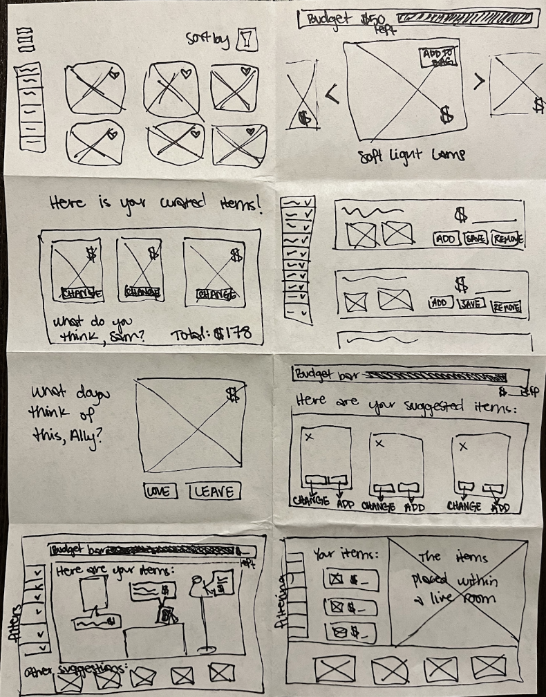
When looking at all of the sketches I developed, I decided to move forward with the second to last sketch. That was because this design kept budgeting as the number one priority; a budget bar is located at the top of the screen. Below that is a visual of a “live” room where the curated items would be displayed. This allows the user to visualize how those items will look together side by side. Beneath the image of the room are other decor suggestions the user can select from if they have more room in their budget, or if they would like to remove one of the pre-selected items. The left side of this sketch displays filtering options, where a user could change their information such as a different decor style, type of items, or overall budget. In short, this design sketch meets the main goals of the user better than the other options.
Using that sketch, I then created a solution sketch by developing a three-panel board by adding a sketch of the screen before and after the critical one. Below are the three screens side by side: (1) the screen that comes before the critical screen, (2) the critical screen itself, and (3) the screen that comes after the critical screen.

Day 3: Decide.
I began working with the sketch solution I created the previous day. I decided to move forward with this solution because this design simulates a user interacting with an interior designer, the element user’s desired if they could dream up an ideal circumstance for decorating their new home. This design solution offered the user a starting place with purchasing decor items, thus reducing the likelihood of them getting overwhelmed with not knowing where to start. To flesh out this idea, I spent about 2 hours developing a storyboard for a user through the following main flow.
Questionnaire:
First, the design solution simulates a consultation with the user by having them complete an initial style/information quiz, much like the questions an interior designer would ask their client. Here, the user answers questions about their style and item preferences as well as input their budget for the decor items.

Design Consultant:
After receiving that information, the website (acting as the interior designer) would then take that information and present the user with a curated decor kit to get the new homeowner started. This mirrors how an interior designer would present decor ideas to their client after their initial consultation. In this case, the client would then have the space to voice what items they like or dislike. By curating a kit of suggested decor items, the user is presented with a place to start, but they also remain in control of the design process by being able to still remove items from the curated decor kit and add new ones that they prefer instead. See how a poster was removed from the “live room” between screen 7 and screen 8.

“Live Room”:
The reason for including the “live” room (where items are displayed as if they were present in a living space) is because it allows the user to not just view a decor item but visualize it in a living space next to the other pieces they are purchasing. This directly meets the needs of users who are concerned that what they order will look good together as a cohesive unit of decor. In this storyboard, the user removed an item and then changed one of the style preferences in the filter options to give them other suggestions.
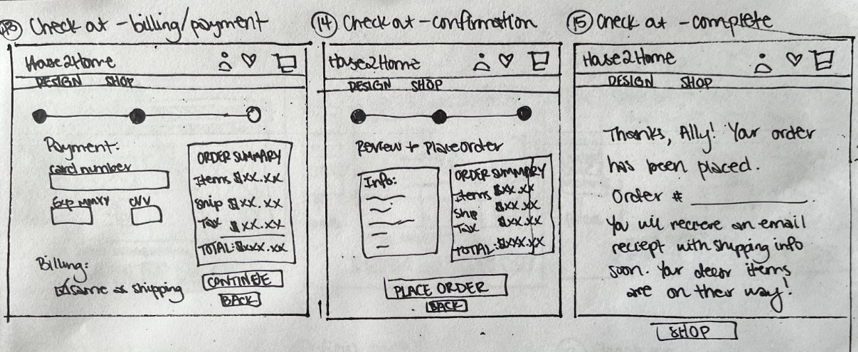
Checkout with Budget Bar:
After choosing a new item, the user then moved forward to view their cart and checkout. The budget bar was retained in the checkout process because it alleviates any other stress about a user spending more money than they had intended.
Overall, I was surprised by how much I enjoyed this sketching process! Since it was a sprint, I knew this flow had to stay on the one track and be completed quickly. I didn’t have much concern for neatness, but wanted to get the main UI elements down on paper.
Day 4: Prototype.
I used Figma to create a prototype of House2Home’s website.


The prototype came together within a day (~7hours), and I believe it reflected the solution I envisioned. I realized how helpful and constructive it was to have my sketches to refer to. All I allowed myself to create was hi-fi mocks of those screens--nothing more--nothing less. I was forced to make quick design decisions (good ones) and then move forward to the next decision without questioning the ones prior.
Check out the prototype yourself:
I spent the remainder of this day, preparing for a day of testing. I reasoned that I wanted to learn the following:
Since most testing participants have experienced stressful moves and decorating processes in the past, I planned to ask for their feedback on whether this solution alleviated that stress.
Second, I particularly wanted to gather feedback about whether the style quiz made sense. Do the users understand what was being asked of them and why they are being asked those questions? What do the users think those questions will result in?
Third, I hoped to observe the users interacting with the curated decor kit and the live room feature. Do they understand the purpose of the “live room,” how to change the products that are available, and how do they interact with the ones displayed in the room?
Lastly, I wanted to see how smooth the checkout process is for the participants. Does the purchasing process alarm users at any point? Is it clear and concise?
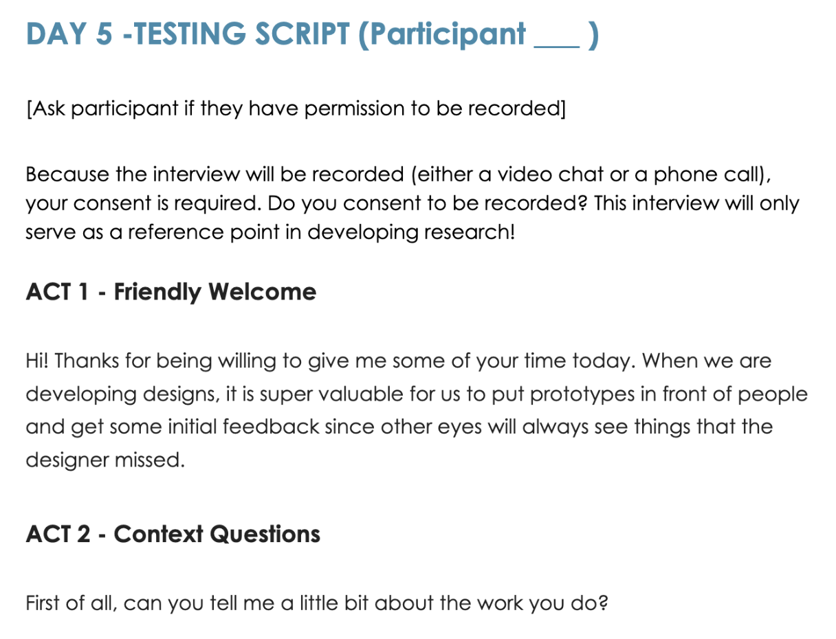
Day 5: Testing.
From the Google Form I created on the first day of the sprint, I contacted five willing participants and scheduled four virtual tests and one in-person meet-up. All of the participants had moved more than twice in the past three years. Though the moves were caused by different life circumstances, each testing participant expressed that they felt overwhelmed with decorating to some degree. I used the 5-Act interview as a framework to create a testing script for each session. Below is a screenshot of the beginning of the script:
Below is a brief clip from the test session with the fourth participant:
Interviewing was surprisingly smooth! I felt very equipped with the 5-Act framework and the script I’d developed. That script kept the testing session within a neat 20 minute time block. The only main challenge I encountered was needing to continually ask participants what they thought of certain screens/steps because they did not verbally process through their thoughts.
Overall, all of the participants enjoyed the brand design. They remarked that the visual design felt bright, clean, trendy, and organized. The website from welcome to order completion was easy and simple to use. The following are the results from the testing:
100% of participants successfully completed the style survey
100% of the participants said the style survey was fun and enjoyable
100% of participants understood and appreciated the budget bar
They felt it heard their voice in budget being an important factor in purchasing decor items.
100% of the participants appreciated the live room display
The display didn’t overwhelmed the users, and it helps them visualize what certain products would look like in a space by reflecting their proper proportions and design cohesion next to the other products.
100% of participants successfully removed and added an item to the display room
80% of testing participants successfully added items to their shopping cart
100% of testing participants successfully purchased the items

I truly do believe in five is the perfect testing participant number. Even after I had tested the prototype with three participants, I already saw the main places of both validations for the design and friction in the user’s experience.
Final Thoughts:
During the testing process, a few common themes surfaced that warranted further thought. Three of the five participants were confused about different options on the welcome page to “Design” and “Shop.” The copy “Free design services” was vague and therefore interpreted to mean a number of different things by the users. One user, for example, assumed it would match them with an actual interior designer who would help them select items. A better copy for this page would be “Style Quiz” or “Survey” since that more accurately matches the following process. In short, iterations should be made to make sure that the copy matches the user’s expectations. Similarly, it was mentioned that the budget scale should be specified as the “total budget” scale, not the budget for an individual product.
Another common theme was users concern with trust and security. Two participants wished the text on the welcome page of the website was larger and included more detail about the company. Another participant was concerned that there were no other tabs such as “About Us” or “Contact Us” on the welcome page. This would have helped the participant feel more comfortable since those tabs are found on most legitimate e-commerce websites. Additionally, three participants expressed hesitation in giving the website their personal information on the first page of the style quiz/survey. Moving forward, it would make sense to move the information portion of the survey to the end of the style quiz, after House2Home has built more trust with the user. Later on, in the checkout process, one participant was concerned that no other payment options such as Amazon Pay or PayPal were available.
Lastly, there was a little friction in some of the visual designs of the prototype. On the review page of the checkout process, a participant noted that the information still had the same blocked outline rather than a greyed background. The outlined box made them think it was a text field. This is an easy iteration to incorporate moving forward. A final suggestion was made about adding a small numeric notification to the cart icon in the top right, acting as a form of confirmation about how many items had been added to the shopping cart.
Overall, I was thoroughly impressed with the process of the design sprint. I can see the benefits of using a truncated design cycle to quickly test and validate whether certain design features warrant further iterations or not.