Sked.
An app designed to help high schoolers with time management.

Scope: 4 months
Role: UX Researcher/Designer
Team: Product designer, Tiffany Eaton, provided guidance and collaboration throughout this project
Tools: Figma, Miro, Overflow, Google Docs, Sheets, & Slides
Skills: UX Research, Information Architecture, Sketching, Wireframing, Visual Design, Usability Testing
Context.
“Sorry, Miss Skiens, I forgot.”
“Sorry, Miss Skiens, I didn’t have enough time after practice.”
“Sorry, Miss Skiens, I had too many other projects to do.”
These were the statements I regularly heard when I asked students to turn in their homework. As a former high school teacher, I began to notice an interesting trend over time; no matter the commitments or proclivities of a student, nearly all struggled with time management.
It was this personal experience that motivated me as the designer to find a solution for current and future teens.
With the guidance of a product designer, I spearheaded the entire design process of this project from initial user research to iterations, prototyping, and testing.
Solution.
Enter Sked, an app designed to help high schoolers manage their time and the demands of their daily lives. In short, it serves as a consolidated space where students can turn to to find their daily schedule, assignments linked from other school accounts, events such as practices or rehearsals, or tasks like chores.
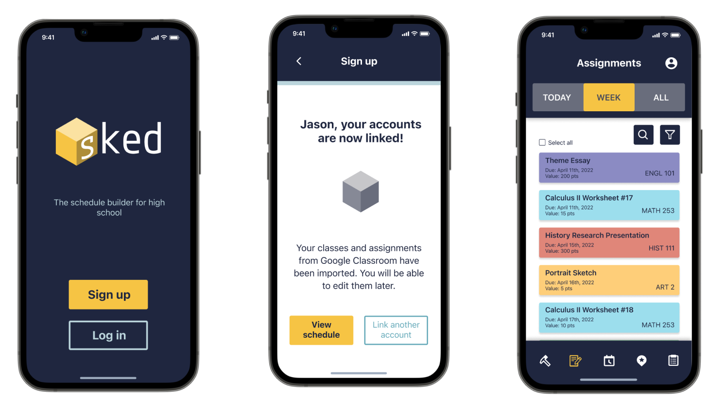
Link assignments.
Upon creating an account, students are able to conveniently link their accounts and import assignments from other sources like Google Classroom.

Build up and break down your schedule.
The primary visual concept of Sked is based on building blocks. Students are able to build their daily agenda by stacking blocks and then breaking the blocks apart when an event, task, or assignment is completed.
Within the default home page of a student’s daily schedule, they can toggle between different dates and even preview past events. Sked conveniently alerts students when they have time to complete something else!

Personalize and set reminders.
Using the bottom navigation bar, a user can also access their assignments, events, and tasks in a list view.
Sked allows students to alter their daily schedules by editing events. They can add a time, a date, a location, details, and even choose a unique color for that “block.” Since students have so much to remember, Sked helps students set reminders for any assignment, event, or task!
Process.
User Research - A Place to Begin
To understand user needs, I conducted both secondary and primary research. My findings in the secondary research confirmed my hypothesis, that time management is a critical skill for teenagers to develop and that it is lacking in current school curriculum.
“A primary source of stress for 55% of high schoolers was ‘Procrastination or time management.’”
Something I learned in my days as a high school teacher was the value of letting your students’ voices be heard. They have so much to contribute and add; they simply want to feel like they have a respected seat at the table. So, with user interviews, they had one. The interview process was challenging to keep the high schoolers focused on the topic of time management, but I believe my years as a teacher prepared me well for this hurdle.

Analysis - A Place to Synthesize
When reviewing my interview notes, I found that a gap exists between a student knowing that time management is important and actually practicing it in daily life. Through affinity mapping, I was able to distill my notes down and identify the different factors that influence a student’s ability to manage their time: parental involvement, peer community, mental health, and environmental factors/habits.
The following were other key insights gleaned from the user interviews:
100% of students expressed negative emotions (feeling stressed, anxious, and/or overwhelmed) in relation to managing their time and daily demands.
83% of students do not feel emotionally supported by their schools to help them manage their time.
100% of students agreed that time management is extremely important for both adolescent and adult life.
These findings later informed the choices made for Sked’s style guide. Since students need a solution that offers them the support and organization many currently lack, the brand needed to be supportive, simple, organized, and structured.
Another insight I found when analyzing the qualitative research was the gap in a student knowing what to do (content) and how or when to get it done (the means). It was encouraging because, through these interviews of frustration, students still remarked about their desire to learn how to manage their time. There is a need and a desire. Now, for a solution to bridge that gap!
Personas - A Place to Empathize
Because high schoolers represent such a broad spectrum of personalities and profiles, I created two personas based on my insights from the user interviews to inform design decisions ahead.
Meet Jason & Sofia!

Ideation - A Place to Dream
I turned my analysis and insights into a “How Might We” question to guide the next phase of ideation. The question which guided my thinking was the following:
“How might we help high schoolers feel less anxious and more confident in handling their lives outside of school?”
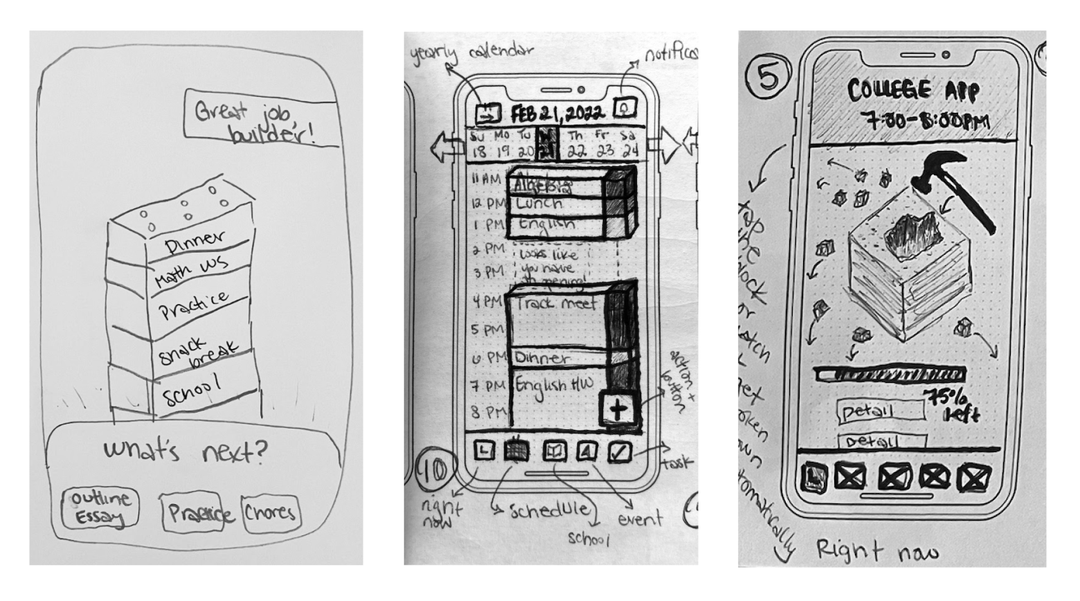
Though brainstorming yielded many ideas to solve this problem, I decided on a concept that allowed students to visually build their schedule, like stacking building blocks or Legos. This evoked the playfulness of childhood while giving students a way to feel like they are in control of their day! Students get to decide what goes where, what to break apart and what to build up. Against the other ideas, this concept was the only one that also provided users with their expressed need of structure and simplicity.
With Sofia and Jason in mind, I considered potential scenarios or stories a user would have when encountering this platform. For example, I know Sofia would need to be able to edit her work schedule if her boss changed any upcoming shift. Likewise, Jason would most likely want to set reminders for upcoming activities since he tends to be forgetful.
From this reflection, I fleshed out several user stories, and sorted them by content and priority to produce my MVP. Please view Row 1, 10, an 12 below to get an idea of what these users would like to do!

Flows - A Place to Plan
From there, I produced three specific user flows, or main routes, that would guide my sketching, wireframing, wireflows, and eventually, high-fidelity mock-ups.
Flow 1: Jason wants to create an account and Link his Google Classroom account in order to import assignments.
Create an account.
Input full name, email, password, and confirm password.
View daily schedule.
Create new event.
Create new assignment.
Link assignment from another account.
Sign in and link Google Classroom account.
Review details and confirm.

Flow 2: Sofia wants to rearrange her schedule for tomorrow.
View daily schedule for tomorrow.
Click shift for work.
Edit event details.
Preview new details and confirm.
Go to tasks.
Select college application to edit.
Edit task details to include a time for tomorrow.
Preview new details and confirm.

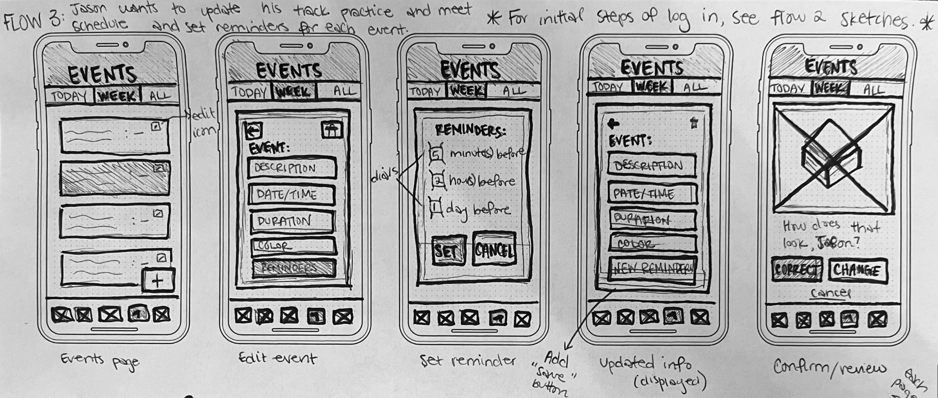
Flow 3: Jason wants to update his track practice and meet schedule by setting reminders for each event.
View all events.
Filter by “sports” category only.
Select all.
Click to edit.
Set a reminder to apply to all.

Prototyping - A Place to Create
After sketching out the red routes, I created an early prototype using the MarvelPOP app by taking screenshots and linking them through basic animations. Then, I put it in front of high schoolers for guerilla usability testing!
5/5 of the students were able to successfully complete the prompted tasks, with a little help. While the guerilla usability testing confirmed that the design concept was on the right track, it did unveil many areas for iteration.

One common pain point was the lack of reassurance.
Because my sketches didn’t offer a “save” or “set” button to confirm the user’s action. Some of the high schoolers were uncertain about whether or not they had in fact properly set the reminders when prompted to do so during testing. For that reason, I made sure to include a “preview” or confirmation page that is displayed after setting a reminder.
Another frustration was confusing or insufficient exit paths for the user to back out of an action. For that, I made sure to remain consistent in providing back arrows on each screen. You can see how I addressed these issues in the wireframes on the right.
Before moving forward with the hi-fi mock-ups, I needed to consider Sked as a brand. What was its purpose? What should Sofia and Jason feel when they interact with this interface? Because Sked has been uniquely designed to make time management less stressful and enjoyable, I settled on the following brand attributes:
Structured Supportive Simple Playful
Initially, I wanted to use a color palette that was bright and vibrant. However, I ran into some difficulties settling on a final color scheme. This was primarily because I knew users would eventually be populating their schedules with brightly colored blocks. Therefore, the background/brand identity would need to have a strong contrast to the extensive block color options. An entire style guide was built to accompany the subsequent hi-fi mock-ups.

Testing - A Place to Iterate
After finalizing my visual design decisions, I refined my wireframes into high-fidelity mock-ups. I then tested the high-fidelity mock-ups, iterated the designs based on feedback, and tested for usability a second time.

Issue #1: Icons in Navigation Bar
Problem: Through both the first and second rounds of usability testing, users expressed confusion with the icons in the bottom navigation bar.
Solution: Many iterations were made to the icons and symbols used in the bottom navigation bar. See a more detailed explanation of those changes below.
The “right now” icon was changed from a clock to a hammer since the student uses the hammer to destroy their current block. The clock seemed to confuse the users with their daily schedule. Since the daily schedule is the main default page of the app, it was moved to the middle icon. The original book icon for “assignments” was altered to the page and pencil because the book was not a strong enough reference for assignments. The “check” in the events icon made students think of tasks, so it was modified to the star/location symbol since events typically are at a specified location. Lastly, the “tasks” clipboard was only slightly changed to include a bullet list rather than mere lines. During the usability testing, students expressed that a bullet list would make more sense for that icon.

Issue #2: Filtering & Editing
Problem: In the first round of usability testing, students repeatedly expressed uncertainty and confusion when asked to filter and edit all events.
Solution: Many of these screens required visual validation for the user to know when an action had been performed or a prompt on how to perform the next action.
Initially, students were concerned that their sorting selection would not save since there wasn’t a “save” or “apply” button. To reassure the student, I added the “save” button below the dropdowns in the Sort by page. I also iterated this page to be its own separate page. Before, the “Events” page was kept in the header, but this seemed to complicate the screen and confuse users. Additionally, students were unsure of how to click or check the categories since there was no open checkbox. On the right, you can see that checkboxes were added to clarify what the user should interact with.
Originally, there was no change to the separate events when “select all” was activated. Because of this, users expressed uncertainty about whether all of the events were selected and/or uncertainty about what to do next to edit them all together.
I added a change of state to the items when “select all” was clicked, where the separate events took on a darker background color. This was another visual sign of validation for the user that all of the following events have been selected.
Lastly, I added an “edit” button to appear after “select all” was clicked, acting as a prompt to guide the user to their next steps and prevent frustration.
In the second round of testing, 100% of the users were able to successfully complete the tasks.
After the second round of usability testing, 100% of the users were able to successfully complete the tasks. However, only 60% of the users were able to correctly identify the icons in the bottom navigation bar. Though iterations were made to these icons after the first round of usability testing, there remained inconsistencies in user understanding. Most of the testers remarked that the confusion was not about the icon but due to a lack of familiarity with the interface itself. A potential step moving forward would be to add pop-ups in a tutorial (after initial sign-up) that explain each icon.
Overall, the primary design challenges were solved throughout the course of testing to offer students a frictionless way to create and edit their schedules.
Key Learnings - A Place to Reflect
This particular case study taught me the importance of relying on the user through the design process. In moments where I was unsure of how to proceed, I need only put myself in the shoes of Sofia and Jason to think of what they might want in that moment. I realized the core purpose of designers is to be user advocates throughout the entirety of the design process.
Additionally, I learned the value of testing and iterating to gain feedback and continue to improve the designs. The high schoolers were so quick to identify the pain points in the user flows; it made iterations that much easier!
Lastly, I learned that no design is ever perfect or complete. I was frustrated that even after multiple modifications, users still experienced confusion over understanding the bottom navigation bar icons. New users would greatly benefit from an onboarding tutorial in the order to learn the purpose of these icons.